Bastrop County Cares:
Designing a More Accessible Digital Experience
A bilingual website redesign that made community resources easier to navigate, easier to manage, and more effective at driving engagement.

Company
Bastrop County Cares is a nonprofit organization serving Bastrop County and Central Texas through partnerships, community initiatives, and resource-driven programs that support long-term wellbeing.
Overview
Industry: Nonprofit / Community Services
Timeline: October 2024 – April 2025, ongoing priojects
Team: Executive Director, Communications Director, Social Media Team, Contract Web Developer
My Role
Lead Designer and Project Manager
I led the project from strategy through launch, partnering closely with the Communications Director and Executive Director.
- Project management and weekly review coordination
- Content planning, writing, and editing
- UX analysis, site structure, and wireframing
- Visual design and brand system refinement
- Website design in Figma
- Front-end development in WordPress / Divi
- Email marketing transition and automation setup
This was a highly collaborative engagement that required balancing design leadership, content strategy, technical coordination, and day-to-day project momentum across a team with limited internal capacity.
Project Summary
Bastrop County Cares needed a website that better reflected the scale and value of its work. The existing site was difficult to manage, hard to navigate, and not fully supporting the organization’s goals around community access, program visibility, and engagement.
I led a full website redesign that combined content strategy, UX thinking, visual design, WordPress implementation, and email automation support. The result was a cleaner, more intuitive bilingual platform that helped the team communicate more clearly, manage content more efficiently, and create a better experience for the communities they serve.
Before/After Home Page


Before/After Collaboratives Page


The Challenge
Bastrop County Cares needed more than a visual update. The existing site was hard to navigate, difficult to manage, and not clearly serving the needs of community members, partners, and donors.
The project also came with technical and operational hurdles, including bilingual requirements, limited access to legacy systems, and tools that were no longer supporting the team effectively. The goal was to create a platform that was clearer, easier to maintain, and better aligned with the organization’s mission.
The Strategy
I approached the redesign as a systems-level improvement, not just a new look. That meant simplifying the site structure, refining the visual language, and building a platform the team could manage more confidently over time.
The experience was organized around the organization’s four core pillars—Economic Stability, Education, Health, and Thriving Communities—to create clearer navigation, stronger storytelling, and a more intuitive path through the content.
The Process
This project consisted of 5 phases:
Phase 1: Brand System Refinement
The organization already had brand guidelines, but the system had become inconsistent and overly complex in practice. The logo remained the same, but I streamlined the supporting brand system by reducing unnecessary logo variations, removing fonts that were not adding value, narrowing the tint palette to the lighter shades, and expanding the icon family for more flexibility within a more controlled system.
The biggest shift was in how the core shapes were used. Instead of appearing as bright standalone graphic elements, I reworked them into softer, more subdued background shapes using the existing color palette. This kept the brand recognizable while giving it a more polished, cohesive, and approachable feel.
Before/After Color Palette
To make the brand easier to apply, I simplified an overly complex color palette into a more focused set of usable colors with clearly defined hex codes.


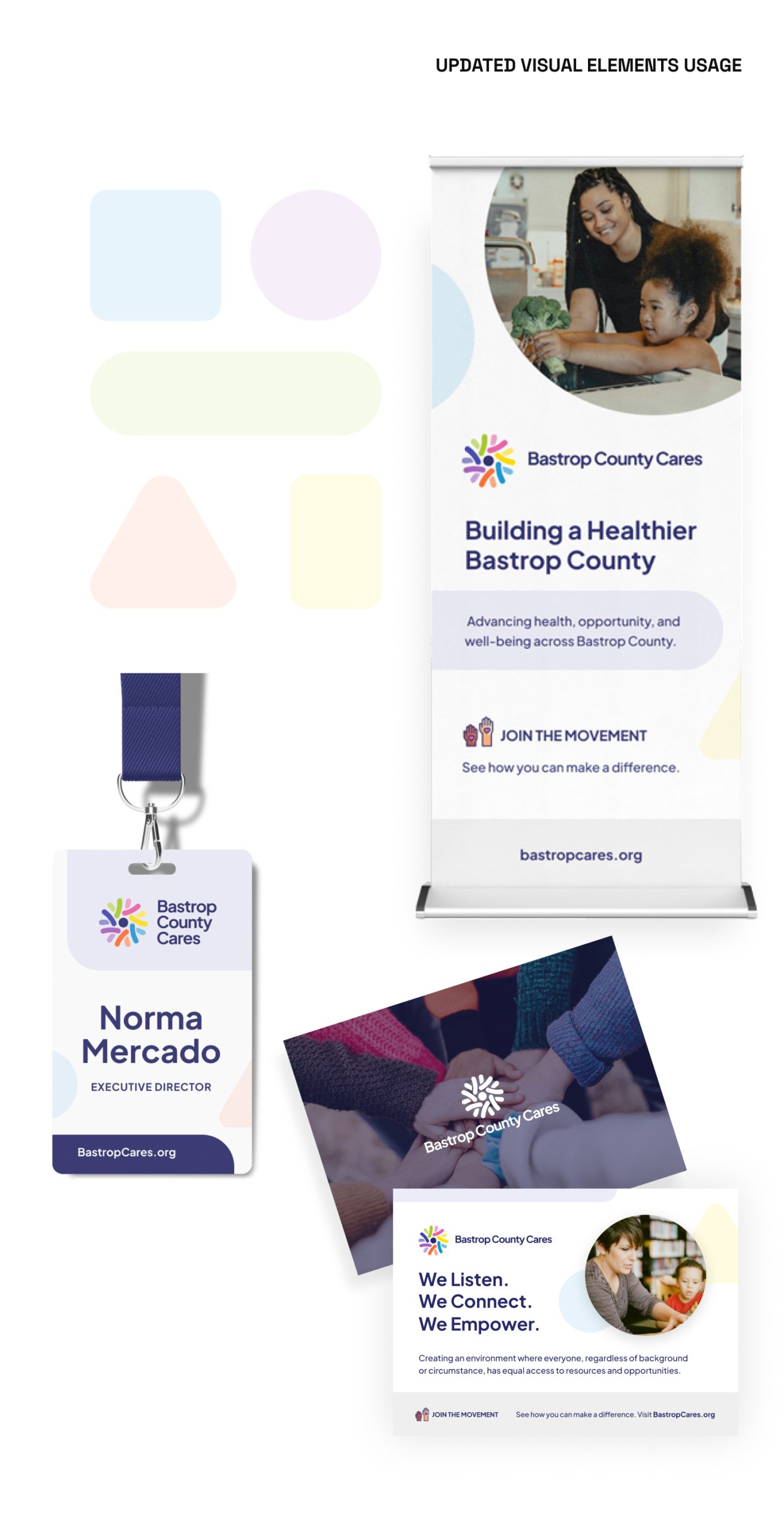
Before/After Visual Elements
I updated the visual language by softening the color treatment and moving the core shapes into the background rather than using them as dominant graphic elements. The result was a cleaner, fresher, and more approachable brand expression.

Before/After Logo Options
The original logo guidelines offered too many variations, which created confusion around what to use and when. I simplified the system into three core logo layouts.


Phase 2: Content and UX Strategy
I worked closely with the Communications Director to reorganize and rewrite content around the organization’s mission and service model. Together, we aligned the site architecture with the four core pillars, creating a clearer structure for users and a stronger narrative for the organization.
This phase helped reduce friction across the site by improving content hierarchy, simplifying pathways to key information, and making it easier for users to understand what Bastrop County Cares does and where to go next.


Phase 3: Website Design in Figma
With the content structure in place, I designed the full website in Figma. The visual direction balanced warmth and professionalism through clean layouts, rounded forms, bright iconography, and approachable imagery.
I focused on making key actions more visible—especially around donations, events, and community resources—while using the pillar framework as a visual anchor throughout the site. The goal was to make the experience feel both mission-driven and easy to use.
Home Page Design


How We Help Page Design


Phase 4: WordPress Development and Launch
Once designs were approved, I built the site in WordPress using Divi. I created reusable modules and global elements to make the system more efficient and easier for the team to manage after launch. Every page was developed to reflect the approved designs while also ensuring responsiveness, performance, and consistency across devices.
This phase also involved QA, launch coordination, redirect planning, and collaboration with a developer to support bilingual structure and technical implementation.

Phase 5: Email Marketing and Automation
During the project, it became clear that the existing email platform was no longer a good fit. I led the transition to a more flexible system and created branded templates and automation flows that aligned with the new website.
Although this was not the original scope, it became an important extension of the project—helping the organization create a more connected user journey from website visit to ongoing communication.
Newsletter Template
Using Mailchimp, I created a branded newsletter template and automation flow that helped connect website engagement with more consistent follow-up communication.

Results
The redesign delivered clear improvements in traffic, engagement, and content performance. Comparing pre-launch data from February–March to post-launch performance after the April 2025 launch, the site saw a substantial lift across key metrics.
- Total users increased by 502%
- Sessions increased by 426%
- Page views increased by 338%
- New users increased by 91% from March to post-launch
- Average engagement time also improved
These results point to a stronger overall user experience, clearer content structure, and a site that better supports both discovery and engagement.
Reflections
This project reflects how I approach design as a connected system—not just a visual exercise. The strongest outcome came from looking at the full picture: brand consistency, content clarity, user experience, backend usability, and communication workflows.
It also shows the kind of role I naturally play on complex projects. I do my best work when I can connect strategy to execution, bring structure to moving parts, and create solutions that are not only polished, but practical for the teams using them every day.

